A Data-Driven Guide on How to Improve Ecommerce Conversion Rates
Improving your ecommerce conversion rate isn’t about finding one silver bullet. It’s a systematic process: you diagnose what’s broken, test potential fixes, and refine your approach based on what the data tells you. It’s about smoothing out all the little points of friction in the user experience, site navigation, pricing, and checkout that cause good customers to walk away.
The core idea? Make it as easy and trustworthy as possible for a visitor to complete a purchase.
Your Starting Point for Higher Ecommerce Conversions
Every ecommerce team wants to know the secret to improving conversion rates, but the answer is a continuous cycle of improvement, grounded in understanding how real people behave on your site. The journey from a casual browser to a loyal customer is a minefield of potential drop-off points. A confusing product page, a site that loads at a snail’s pace, unexpected shipping costs popping up at the last minute—any of these can kill a sale in seconds.
Effective conversion rate optimisation (CRO) is all about systematically identifying and plugging these leaks in your sales funnel. It has to start with a deep dive into your data to understand where and why people are leaving. Is your mobile experience a mess compared to desktop? Are certain traffic sources bringing in tyre-kickers instead of buyers? Answering these questions is the only way to build a strategy that actually works.
The Core CRO Framework
The whole process boils down to three fundamental stages: diagnosis, testing, and refinement. This isn’t a one-and-done task; it’s an iterative loop that ensures every change you make is driven by evidence, not just a gut feeling. Each adjustment, whether it’s a tweak to your site’s navigation or a major pricing overhaul, should be treated as an experiment with a clear, measurable outcome.
This visual breaks down the core loop that drives real conversion improvements.
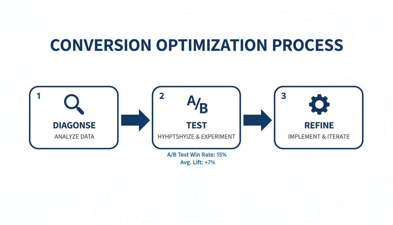
This simple but powerful framework—Diagnose, A/B Test, Refine—is your guide for moving from identifying problems to implementing solutions that are proven to work.
When you adopt this mindset, you stop putting out fires and start proactively building growth. You’re not just fixing what’s broken; you’re building a more resilient, customer-friendly, and ultimately more profitable online business. The crucial first step is a thorough, honest look at your store’s performance. For a closer look at how to get started, you can learn how to analyse Shopify data to boost ecommerce growth in our detailed guide.
Key Takeaway: Real conversion optimisation isn’t about guesswork or chasing the latest trend. It’s a disciplined, data-driven method that relentlessly focuses on removing friction for your customers.
To help you get there, we’ve outlined the key areas that almost every ecommerce store can improve upon. Think of this as your starting checklist for optimisation efforts.
Key Areas for Conversion Rate Optimization
| Optimization Area | Core Objective | Example Tactics |
|---|---|---|
| User Experience (UX) | Make the site intuitive and easy to navigate, reducing user frustration. | Simplify navigation menus, improve mobile responsiveness, speed up page load times. |
| Pricing & Promotions | Present value clearly and use offers strategically to encourage purchase. | Test pricing tiers, offer free shipping thresholds, create clear discount codes. |
| Checkout Process | Remove barriers and build trust to minimise cart abandonment. | Enable guest checkout, offer multiple payment options, show security badges. |
| Personalisation | Show relevant content and products to individual users to increase engagement. | Display recently viewed items, recommend related products, tailor content by location. |
Focusing on these four pillars will give you the biggest leverage in turning more visitors into customers.
This guide will walk you through this entire process. We’ll cover how to:
- Diagnose Funnel Leaks: Use analytics, heatmaps, and session recordings to find exactly where users are dropping off.
- Implement Actionable Fixes: Apply proven strategies across user experience, checkout, pricing, and personalisation.
- Measure and Monitor Success: Define the key performance indicators (KPIs) that matter and set up alerts to stay ahead of problems.
By the end, you’ll have a clear roadmap for turning more of your hard-won traffic into paying customers.
Diagnosing the Leaks in Your Conversion Funnel

Before you can fix your conversion rate, you have to find out what’s breaking it. Optimisation without a proper diagnosis is just guesswork, and nobody has the budget for that. You need to become a detective, following the clues your customers leave in the data to pinpoint exactly where they’re abandoning their journey.
Think of your website as a physical pipeline. If the reservoir at the end isn’t filling up, you don’t start randomly patching the pipe. You walk the entire length, looking for specific leaks—some are small drips, others are major gushes. This is the essential first step.
Uncovering Drop-Off Points with Data Analytics
Your starting point is always your web analytics platform, like Google Analytics. This is where you get the high-level map of user flow. Dive straight into your conversion funnel report and look at the drop-off rates between the key stages: landing on a page, viewing a product, adding to cart, initiating checkout, and finally, completing the purchase.
Look for the biggest percentage drop. Is it between the product page and the cart? A significant leak there might point to issues with your product descriptions, imagery, or pricing. Is the drop-off massive between initiating checkout and payment? This is a huge red flag for friction in your checkout process—think unexpected shipping costs or a confusing form. To tackle this common leak, it’s critical to implement effective strategies to reduce cart abandonment.
Pro Tip: Don’t just look at the overall funnel. Your average conversion rate can be misleading. Segment your data to uncover the real stories hidden underneath.
By slicing the data, you can isolate problems affecting specific groups. Common segments that almost always yield valuable insights include:
- Device Type: Mobile vs. Desktop vs. Tablet
- Traffic Source: Organic Search vs. Paid Social vs. Email Marketing
- User Type: New vs. Returning Visitors
- Demographics: Location, Age, or Gender
For instance, UK ecommerce data consistently shows desktop users converting far better than mobile shoppers. Desktop conversion rates can hit 3.9% while mobile often languishes around 1.8%. That 117% performance gap is a massive opportunity, especially since mobile traffic usually dominates in sheer volume.
Observing Real User Behaviour
Quantitative data from analytics tells you what is happening, but qualitative data tells you why. This is where you need to see your site through your customers’ eyes.
Heatmaps are brilliant for this. They show you exactly where users are clicking, moving their mouse, and how far they scroll. Are they clicking on non-clickable elements? That’s a clear sign of confusing design. Are they missing your main call-to-action because it’s below the fold?
Session recordings are even more powerful. I’ve found watching these to be an eye-opening and sometimes humbling experience. You see real people rage-clicking in frustration, getting stuck in loops, or struggling to find basic information. These recordings provide undeniable proof of specific UX problems that need fixing.
Automating the Diagnostic Process
Let’s be honest: manually digging through analytics, segmenting data, and watching hours of session recordings is incredibly time-consuming. It takes expertise and constant attention that most teams just don’t have.
This is where AI-powered tools come in and completely change the game.
An AI data analyst like Menza plugs directly into your data sources (like Shopify and Google Analytics) and automates this whole diagnostic process. Instead of you hunting for problems, it proactively monitors your key metrics 24/7.
When it spots a significant conversion drop for a specific segment—say, for mobile users coming from your latest Instagram ads—it doesn’t just show you a chart. It sends you a plain-English alert explaining exactly what happened, why it matters, and the potential revenue impact. This frees up your team from constant data-checking and lets them focus on what they do best: implementing fixes, not finding them. Our own research from analysing 1 million Shopify orders shows just how many of these hidden patterns exist in ecommerce data that automated tools can surface in minutes.
Optimising User Experience and Site Navigation

Alright, you’ve pinpointed where people are dropping off. Now comes the real work: fixing the leaks. A clunky, confusing, or slow website is probably the fastest way to kill a sale. Improving the user experience (UX) is all about removing friction, building trust, and creating a smooth, intuitive path from the moment someone lands on your site to the second they complete their purchase.
Think of your website as a physical shop. If the aisles are cluttered, the signs are unhelpful, and the checkout queue snakes around the building, customers are going to walk straight out. Your online store is no different. Every single element needs to guide the shopper effortlessly towards what they came for.
Crafting High-Converting Product Pages
Your product page is where casual browsing crystallises into buying intent. Honestly, it’s the most critical page in your entire funnel, and even tiny improvements here can deliver massive results. The goal is to answer every potential question and dissolve any hesitation a shopper might have, often before they even realise they have it.
This goes way beyond just listing specs. You need to focus on three core areas:
- Compelling Visuals: Your customers can’t touch or feel the product, so your imagery has to do all the heavy lifting. Use high-resolution photos from multiple angles, show close-ups of materials and textures, and include lifestyle shots of the product in use to give a sense of scale and context.
- Benefit-Driven Copy: Don’t just list features; explain the benefits. Instead of saying “100% organic cotton,” try something like “Breathable, buttery-soft fabric that’s gentle on your skin.” Use scannable bullet points and short, punchy paragraphs that speak directly to what your customer actually wants.
- Authentic Social Proof: Customer reviews are absolutely non-negotiable. Displaying ratings and real testimonials directly on the product page builds instant credibility. It’s not just a nice-to-have; research shows that pages with customer reviews can see conversion lifts of up to 270%.
To really move the needle on your conversion rates, it pays to get granular with every component on these pages. For a masterclass on this, check out the ultimate guide to product page optimization for higher conversions—it’ll help you make sure every detail is working towards that final click.
Streamlining Site Navigation and Search
If shoppers can’t find what they’re looking for in a few seconds, they’re gone. Intuitive navigation isn’t a luxury; it’s a fundamental requirement. Your main menu should be simple, logical, and use clear, descriptive labels that your customers would actually use themselves. No clever jargon.
An effective on-site search is just as crucial. Shoppers who use search often have high intent—they know exactly what they want. Make sure your search bar is impossible to miss and offers helpful features like auto-complete and “did you mean?” suggestions for typos. A search experience that returns “no results” for a valid query is a guaranteed lost sale.
Key Insight: The entire point of navigation is to reduce cognitive load. A visitor should never have to stop and think about where to click next. The path to their desired product should feel obvious, almost automatic.
Prioritising Blazing-Fast Site Speed
In ecommerce, speed is money. A slow-loading site doesn’t just frustrate people; it actively costs you sales. The data is clear: for every one-second delay in page load time, conversion rates can plummet by as much as 12%. This hit is even bigger on mobile, where users have even less patience.
Slow site speed is usually caused by a few common culprits that are entirely within your control to fix.
Actionable Steps for Improving Page Speed:
- Compress Your Images: Large, unoptimised images are the number one cause of slow pages. Use tools to compress your product photos without wrecking the visual quality.
- Minify Your Code: Reduce the file size of your CSS, JavaScript, and HTML by stripping out unnecessary characters and spaces. Most ecommerce platforms have plugins that can do this automatically.
- Leverage Browser Caching: This tells a visitor’s browser to store parts of your website locally. When they come back, the site loads almost instantly because it doesn’t have to re-download everything.
By tackling these core areas—product pages, navigation, and site speed—you’re removing the biggest roadblocks standing between your visitors and the checkout. Each improvement makes for a more seamless journey, building the confidence and momentum needed to convert.
Fine-Tuning Your Pricing and Checkout
This is where the rubber meets the road. A customer can love your brand, be sold on your product, and still bail at the last second because of what happens on the pricing and checkout pages. These final two hurdles are loaded with psychological tripwires and friction. Getting them right isn’t just a nice-to-have; it’s the difference between interest and actual revenue.
Let’s start with pricing. It’s so much more than a number. It’s a signal you send about your brand’s value, quality, and place in the market. A clumsy pricing strategy can scare off good customers or, just as bad, leave a ton of money on the table.
Putting Smarter Pricing Strategies into Play
Good pricing is a blend of art and science. Of course, you need to understand your costs and what competitors are doing. But the real magic happens when you tap into how customers perceive value. One of the oldest tricks in the book is still one of the best: psychological pricing.
There’s a reason you see items priced at £9.99 instead of £10.00. It’s not just a tradition. Even though we all know the difference is a single penny, our brains process that number as being in the “£9 range,” which feels significantly cheaper. It’s a tiny tweak that can have a surprisingly big impact.
Another powerful move is price anchoring. By showing a higher original price next to the sale price (think “Was £50, Now £35”), you create a powerful sense of getting a deal. It reframes the purchase not as an expense, but as a smart saving.
Key Insight: Your pricing strategy should be actively communicating value. It’s not just about what the customer pays, but what they feel they’re gaining for their money.
Discounts are another essential tool, but you have to be careful. Constant sales can cheapen your brand over time, basically training customers to never pay full price. The key is to use discounts to create genuine urgency, not just to move stock.
A few tactics that actually work:
- Threshold Discounts: Offering free shipping or a percentage off when a cart hits a certain value (e.g., “Free shipping on orders over £50”) is a classic for a reason. It nudges customers to add one more item, boosting your average order value while making them feel like they’ve won.
- Limited-Time Offers: Run short, sharp sales tied to specific events or holidays. A clear deadline forces hesitant buyers to make a decision now instead of putting it off.
- Bundled Deals: Package complementary products together for a slightly lower price than if bought separately. This increases the perceived value and is a great way to introduce customers to more of your product line.
Streamlining Your Checkout for Maximum Conversions
If your pricing gets someone to click “Add to Cart,” the checkout process is what has to carry them over the finish line. Unfortunately, this is where a shocking number of sales simply evaporate. Industry benchmarks show that nearly 70% of online shopping carts are abandoned. A clunky or untrustworthy checkout is almost always the main culprit.
The golden rule here is simple: remove friction. Every extra field they have to fill out, every unexpected cost that pops up, every moment of confusion is an open door for them to leave.
Your Checkout Friction Audit Checklist
Run through this checklist on your own site. It covers the most common conversion killers I see. Fixing even one or two of these can make a real difference.
- Is Guest Checkout an Option? Forcing people to create an account is one of the fastest ways to lose a sale. You must offer a clear, easy-to-find guest checkout. No excuses.
- Are Shipping Costs Displayed Upfront? Surprise shipping fees are the number one reason for cart abandonment. Be transparent about costs early on, ideally on the product page itself.
- How Many Form Fields Are There? Go through your checkout form field by field and be ruthless. Do you really need their phone number? Is a second address line essential? Cut everything that isn’t absolutely necessary to get the package to their door.
- Do You Offer Multiple Payment Methods? People expect choices. Beyond standard credit cards, offering digital wallets like PayPal, Apple Pay, and Google Pay can significantly lift conversions. It’s about convenience and trust.
- Is Your Checkout Visually Secure? Make sure you’re displaying trust badges—like SSL certificates and accepted payment logos—prominently. These small visual cues are huge for reassuring customers that their financial details are safe.
By methodically working on both your pricing and your checkout, you’re addressing those critical final moments in the buying decision. A price that communicates value followed by a checkout that’s seamless and secure is a powerful combination that turns hesitant shoppers into repeat customers.
Building a Store People Want to Buy From: Personalization and Trust
In a market flooded with options, a generic, one-size-fits-all store just feels lazy. To actually improve your conversion rates, you have to make each shopper feel like you get them. This is where personalization and trust stop being buzzwords and start being your most valuable assets, working together to get people to confidently hit that “buy” button.

Shoppers now expect relevance. They’ve been trained by the giants to see product suggestions that make sense. When you don’t meet that expectation, your store feels disconnected and old, creating just enough friction to kill a sale. Authenticity is the other side of that coin—people can spot fake marketing a mile away, so whatever you do has to feel genuine.
Make Every Experience Feel Personal
Good personalization isn’t just about sticking a first name in an email subject line. It’s about using what you know about a customer’s behaviour to show them the right thing at the right time, making their journey from browsing to buying as smooth as possible.
A product recommendation engine is table stakes now. By showing items based on what someone has looked at, bought before, or what similar shoppers have purchased, you’re essentially acting as a helpful shop assistant. This doesn’t just make the experience better; it’s a proven way to lift your average order value.
Another powerful tactic is using dynamic content. This means showing different banners, offers, or even hero images to different types of visitors. A first-timer might see a “10% off your first order” banner. A loyal customer might see new arrivals in their favourite category. It ensures your message is always hitting the mark for where they are in their journey with you.
Key Takeaway: Personalization isn’t about being clever; it’s about being genuinely helpful. When you use data to anticipate what a shopper needs and make it easier for them to find it, you’re directly removing roadblocks to conversion.
Build an Unshakeable Foundation of Trust
Trust is the currency of ecommerce. It doesn’t matter how great your product is—if a customer doesn’t feel safe, they will not enter their credit card details. Building that trust requires a conscious, visible effort to signal that your site is legitimate and secure at every single step.
Your first line of defence is displaying clear trust signals. These are the visual cues that put shoppers at ease.
- Security Badges: Make sure your SSL certificate badges (like Norton or McAfee) and payment logos (Visa, PayPal, etc.) are prominently displayed. Put them in the footer, sure, but more importantly, have them visible during the checkout process itself.
- Clear Policies: Your return, refund, and shipping policies should be dead simple to find and understand. Hiding this information just looks suspicious. A link in the footer is the bare minimum; mentioning your “hassle-free returns” policy right on the product pages is much better.
- Authentic Social Proof: Customer reviews, testimonials, and user-generated photos are non-negotiable. Seeing that real people have bought and enjoyed your products is one of the most powerful trust builders you have.
It’s also crucial to know where you stand in your market. For example, the UK ecommerce market has huge swings in conversion rates. The grocery sector hits an impressive 11.1%, while other categories are far lower. Understanding your industry’s benchmark helps you set realistic goals and underscores why trust and personalization are so critical for standing out. You can discover more insights on UK ecommerce conversion rates to see how you stack up.
By weaving genuine personalization into the customer journey and backing it up with strong, visible trust signals, you create an experience where customers feel both understood and safe. That’s the combination that turns hesitant browsers into confident buyers.
Measuring Success and Setting Up Proactive Monitoring
Launching a change on your site is only the halfway point. Without a solid way to measure the impact, you’re essentially flying blind. Improving your conversion rate isn’t a one-and-done project; it’s a constant loop of testing, learning, and refining. This means you need to graduate from occasional dashboard check-ins to a proactive system that tracks progress and flags problems before they spiral.
The whole process hinges on knowing what winning looks like. You have to define the key performance indicators (KPIs) that genuinely reflect the health of your business. These metrics are your compass, telling you whether your optimisation efforts are actually moving the needle.
Defining Your Core Conversion KPIs
Every business is different, but a few metrics are non-negotiable for any ecommerce team. They go beyond the headline conversion rate to give you a much richer picture of how your store is really performing.
Your primary KPIs should include:
- Overall Conversion Rate: The percentage of visitors who complete a purchase. It’s the big number, but it doesn’t tell the whole story on its own.
- Cart Abandonment Rate: The percentage of shoppers who add items to their cart but bail before buying. A high rate here is a massive red flag pointing straight at your checkout process.
- Average Order Value (AOV): The average amount spent each time a customer places an order. Pushing this number up is a powerful way to grow revenue without needing more traffic.
- Customer Lifetime Value (CLV): The total revenue you can expect from a single customer over their entire relationship with you. This metric forces you to think beyond one-off sales and focus on building long-term value. You can find a complete walkthrough in our guide on how to calculate customer lifetime value.
It’s crucial to understand how these metrics play off each other. For example, a change that slightly dips your conversion rate but sends your AOV through the roof could still be a massive win for your bottom line.
Validating Your Efforts with A/B Testing
So you’ve found a potential issue and have a hypothesis for a fix. How do you know if your solution will actually work? Through rigorous A/B testing. This means creating two versions of a page—an ‘A’ version (the control) and a ‘B’ version (the variation)—and showing them to different segments of your audience to see which one performs better.
Guesswork has no place in conversion optimisation. A/B testing gives you the hard data needed to make decisions with confidence. Did changing the colour of your ‘Add to Cart’ button really make a difference? Did that copy rewrite actually lead to more sales? A/B testing gives you definitive answers.
Key Takeaway: Treat every significant change like an experiment. Form a clear hypothesis, run a controlled test, measure the results against your core KPIs, and only implement the winner. This disciplined approach stops you from accidentally rolling out a change that hurts your conversion rate.
From Reactive Analysis to Proactive Monitoring
Checking your analytics dashboard once a week is purely reactive. You’re looking for problems that have already happened and have already cost you money. The goal is to shift to a proactive model where you get alerted to significant metric changes the moment they happen.
This is especially important when you consider market volatility. For example, the UK ecommerce conversion rate can swing wildly, with data showing rates from 2.2% to 3.1% depending on the quarter. Knowing these baseline shifts is vital for setting realistic targets and not panicking over normal market movements.
Setting up automated alerts is the first step. You can create rules that ping you on Slack or email if your conversion rate suddenly drops by more than 10% in 24 hours, or if cart abandonment spikes for mobile users.
This is where an AI tool becomes an indispensable part of the team. Instead of just sending a basic alert, it can automate the entire diagnostic process. It monitors your business 24/7, and when it detects an anomaly—like a sudden drop in conversions from a specific marketing campaign—it provides a clear, plain-English explanation of what happened and why it matters. This allows you to jump on the problem immediately, turning potential disasters into minor hiccups.
Ready to stop digging through dashboards and get proactive answers about your ecommerce performance? Menza is an AI data analyst that monitors your business 24/7, sending you clear explanations when metrics change so you can act before small issues become costly problems. Discover how Menza can automate your analytics today.
Stop guessing. Start knowing.
Menza connects to your Shopify, Klaviyo, ad platforms, and 650+ other data sources. Ask questions in plain English and get answers you can trust — no spreadsheets, no code, no waiting.