
Your Guide to Building a Business Intelligence Dashboard

Think of a business intelligence dashboard as the command centre for your business. It’s the single place where you can see the health of your entire operation in real time. It takes raw, messy data from all corners of your company—Shopify, Google Ads, your finance software—and turns it into clean, visual stories that anyone can actually understand. The whole point is to help you make smarter decisions, faster.
What Is a Business Intelligence Dashboard?
Imagine trying to fly a plane without an instrument panel. You’d have a vague sense of where you’re going, but you’d be missing all the crucial, real-time data needed to navigate safely and avoid disaster. Relying on scattered spreadsheets and static reports is a lot like flying blind. A BI dashboard is your cockpit—it gives you a complete, unified view of everything that truly matters.
At its core, it’s a visual interface that pulls in and displays your key performance indicators (KPIs) from all the different data sources your company uses. Instead of forcing your team to dig through endless rows of numbers, a BI dashboard uses charts, graphs, and maps to show you what’s going on in a way that just makes sense. This means people who aren’t data analysts—from marketing managers to founders—can spot trends, find opportunities, and diagnose problems with a quick glance.
The Power of a Centralised View
The real magic of a business intelligence dashboard is its ability to pull everything together in one place. For an e-commerce brand, that means connecting all the different ‘engines’ of the business:
- Sales Data: Metrics from platforms like Shopify or Magento.
- Marketing Data: Performance from Google Analytics, Meta Ads, and email platforms.
- Operational Data: Information from inventory management and fulfilment systems.
- Financial Data: Figures from accounting software like Xero or QuickBooks.
By bringing these scattered sources together, the dashboard paints a complete picture of business health. This move away from manual, soul-crushing reporting toward automated, visual analysis is a big deal. In the UK alone, the business intelligence market is expected to hit USD 3.0 billion by 2034, driven by this exact need for data-driven strategies in sectors like retail and finance.
To truly grasp the difference, it helps to see how dashboards stack up against the spreadsheets many teams still rely on.
Static Spreadsheets vs Dynamic BI Dashboards
Spreadsheets were a huge leap forward, but they’re a snapshot of the past. A BI dashboard is a living, breathing view of the present. Here’s a breakdown of the key differences:
| Feature | Spreadsheets | BI Dashboards |
|---|---|---|
| Data Source | Manual entry, static imports | Live connections to multiple sources |
| Updates | Require manual refreshing | Automated, real-time updates |
| Visualisation | Basic charts, difficult to customise | Interactive graphs, maps, custom visuals |
| Interactivity | Limited filtering and sorting | Drill-down, filters, segmentation |
| Collaboration | Difficult to share, version control issues | Centralised, shareable, controlled access |
| Scalability | Struggles with large datasets | Built to handle massive amounts of data |
Ultimately, spreadsheets are tools for calculation and static reporting, whereas BI dashboards are built for exploration and ongoing monitoring. They answer different needs for a modern, fast-moving business.
A great BI dashboard doesn’t just show you data; it tells you a story about your business. It answers the question, “What is happening right now?” so you can move on to the more important question: “What should we do next?”
This immediate clarity is what really separates a dashboard from a traditional report. A report is a static picture of the past. A dashboard is a dynamic, interactive tool for the present. You can filter by date, drill down into a specific ad campaign, or segment by customer demographics to uncover much deeper insights.
To see how this works in the real world, it’s helpful to look at various business intelligence dashboard examples to understand their versatility. When done right, a dashboard stops being just a report and becomes the foundation for building a truly data-driven culture in your company.
The Building Blocks of an Effective E-commerce Dashboard
A truly powerful business intelligence dashboard isn’t just a random collection of charts; it’s a thoughtfully constructed tool where every single component has a job to do. Think of it like building with LEGOs. You need the right foundational bricks, the right connecting pieces, and the right feature elements to create something that’s both strong and actually useful.
For an e-commerce brand, this means carefully selecting and combining a few essential building blocks. When these elements work together, they transform a static report into an interactive command centre that fuels smart, swift decisions.
Connecting Your Data Sources
First things first: you have to link all your separate data streams. Most businesses today are data-rich but insight-poor, and that’s because their information lives in isolated silos. An effective dashboard smashes down these walls by connecting directly to the source systems you use every single day.
This unified approach ensures your data is not only complete but also trustworthy. For an e-commerce brand, the key sources usually include:
- E-commerce Platform: Your core sales data from Shopify, BigCommerce, or Magento.
- Advertising Platforms: Performance metrics from Meta Ads, Google Ads, and TikTok.
- Web Analytics: Customer behaviour insights from Google Analytics 4.
- Customer Relationship Management (CRM): Data on customer interactions from platforms like HubSpot or Klaviyo.
- Financial Software: Revenue and profit information from Xero or QuickBooks.
This visual shows the simple but powerful flow: from scattered data sources, into a unified BI dashboard, which then spits out actionable insights.
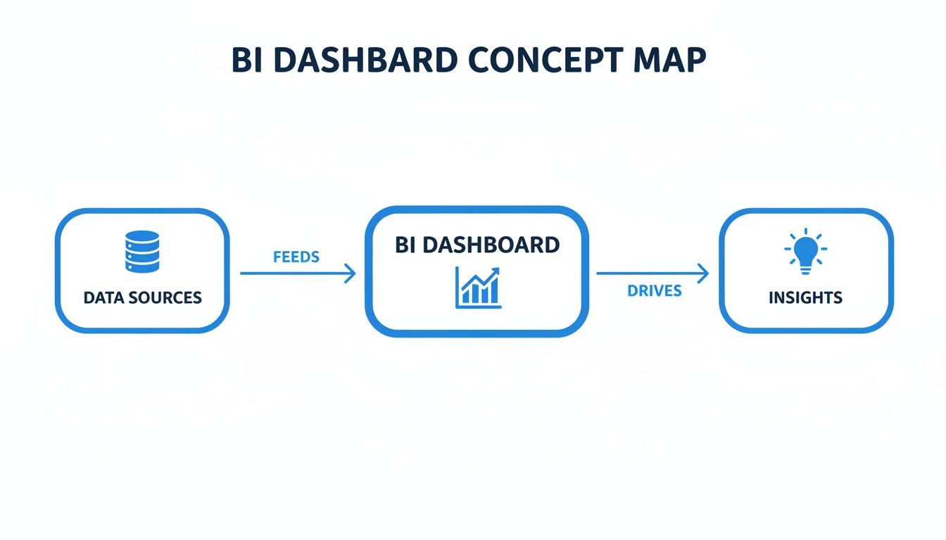
This workflow really highlights a dashboard’s primary role: to act as the central brain that processes raw data into clear, understandable intelligence.
Choosing Impactful Data Visualisations
With your data all piped in, the next job is to give it a visual form. The goal here isn’t to create the most complex charts, but the clearest ones. Picking the right visualisation makes complicated information instantly digestible for anyone on your team, no data science degree required.
For instance, a line chart is perfect for tracking a metric like Customer Acquisition Cost (CAC) over time, immediately showing if your marketing is getting more or less efficient. A bar chart, on the other hand, is ideal for comparing the Return on Ad Spend (ROAS) across different channels like Facebook and Google.
Or take a geographical map. It can instantly pinpoint your top sales regions by postcode, helping you focus your local marketing efforts where they’ll have the biggest impact. The whole game is matching the visualisation to the question you’re trying to answer.
A well-designed dashboard uses visuals to tell a story. It guides the user’s eye to the most important information, turning data from an overwhelming flood into a clear, actionable narrative.
Implementing Interactive Filters and Drill-Downs
Static charts are a decent starting point, but interactivity is what turns a business intelligence dashboard into a truly dynamic tool. Interactive filters let people explore the data on their own terms, digging deeper to understand the why behind the numbers.
Imagine your dashboard shows a sudden drop in your conversion rate. Nightmare. With interactive filters, you could:
- Filter by Date Range: Isolate the exact day the drop happened.
- Segment by Traffic Source: Find out if the drop was specific to organic search or a paid campaign.
- Drill Down by Device: See if the problem was only affecting mobile users.
This ability to slice and dice data transforms your dashboard from a passive report into an active investigation tool. It empowers your team to find root causes without needing to put in a request with a data analyst. When you’re ready to build, a critical first step involves choosing an e-commerce dashboard solution that actually supports these kinds of advanced, interactive features.
Tracking the E-commerce KPIs That Actually Matter
Once you’ve got the bones of a good dashboard in place, the real work begins. It’s not about how much data you can cram onto one screen; it’s about choosing the right data to display. A dashboard overloaded with dozens of metrics is just as useless as a messy spreadsheet. It creates noise, not clarity.
The secret is to focus on the handful of Key Performance Indicators (KPIs) that genuinely reflect the health and momentum of your e-commerce business.
Think of these KPIs as the vital signs for your company. A doctor doesn’t need a hundred tests to get a quick read on a patient’s health—they check heart rate, blood pressure, and temperature. In the same way, you need a select group of metrics to diagnose problems and spot growth opportunities. Grouping them logically gives you a complete picture, turning your dashboard from a simple report into a strategic weapon.
Marketing Health and Customer Acquisition
This group of metrics tells you one simple thing: are you attracting new customers effectively, and how much is it costing you? This is the very top of your funnel, and if it’s not healthy, nothing else matters. Without a tight grip on these numbers, your marketing budget can spiral out of control with very little to show for it.
Key marketing KPIs include:
- Return on Ad Spend (ROAS): This is the bottom line for your advertising. For every pound you put in, how many pounds in revenue come out? A low ROAS is a red flag telling you a specific channel or campaign is bleeding money and needs to be fixed or shut down, fast.
- Cost Per Acquisition (CPA): This shows the average cost to land a single new customer from a particular campaign. Keeping a close eye on CPA is crucial for managing your marketing spend and making sure your acquisition costs aren’t silently eating all your profit.
- Conversion Rate (CR): This is the percentage of people who visit your site and actually buy something. If your conversion rate suddenly tanks, it could signal anything from a broken checkout page to a major issue with your ad targeting.
Sales Performance and Customer Value
Marketing gets people in the door. Sales KPIs measure what happens once they’re inside. These numbers tell you the value of each transaction and, more importantly, the long-term worth of each customer. This is how you turn one-time buyers into loyal, repeat customers who fund your growth.
A great business intelligence dashboard makes the connection between marketing spend and customer lifetime value obvious. It connects the dots between what you paid to acquire a customer and the total profit that customer generates over their entire relationship with your brand.
That connection is where real strategy is born. You can confidently ramp up ad spend when you know it’s bringing in high-value customers who will stick around.
Two critical sales KPIs are:
- Average Order Value (AOV): This is the average amount a customer spends per order. Pushing this number up with tactics like product bundles or smart upsells is one of the fastest ways to increase revenue without having to find a single new customer.
- Customer Lifetime Value (CLV): This KPI predicts the total profit you’ll make from an average customer over time. For any e-commerce brand, CLV is the north star. It should inform almost every major decision, from marketing budgets to retention efforts. You can learn more about how to analyse Shopify data to get a deeper understanding of CLV.
To help bring this all together, here’s a quick breakdown of the most common e-commerce KPIs and how they influence day-to-day decisions.
Top E-commerce KPIs and Their Business Impact
| Business Area | KPI | What It Measures | Decision It Informs |
|---|---|---|---|
| Marketing | Return on Ad Spend (ROAS) | Revenue generated for every £1 spent on ads. | Should we scale or cut this ad campaign? |
| Cost Per Acquisition (CPA) | The average cost to gain one new customer. | Is this channel profitable for customer acquisition? | |
| Conversion Rate (CR) | Percentage of site visitors who make a purchase. | Is our website effectively turning traffic into sales? | |
| Sales | Average Order Value (AOV) | The average spend per transaction. | What upselling or bundling tactics should we test? |
| Customer Lifetime Value (CLV) | Total predicted profit from a single customer. | How much can we afford to spend to acquire a customer? | |
| Operations | Inventory Turnover | How quickly inventory is sold and replaced. | Are we overstocked on slow-moving items? |
| Order Fulfilment Time | Time from order placement to customer delivery. | Do we need to improve our warehouse or shipping process? | |
| Financials | Gross Margin | Profit on products sold, minus cost of goods. | Is our pricing strategy sustainable for profitability? |
| Net Profit | The final profit after all business expenses. | Is the business fundamentally healthy and profitable? |
Thinking about your metrics in this structured way ensures you’re not just tracking numbers for the sake of it, but using them to ask better questions and make smarter calls.
Operational Efficiency
You can have world-class marketing and amazing sales, but your business will still crumble if the operations are a mess. Operational KPIs track how well you manage inventory and get orders out the door. These metrics are the backbone of your business, ensuring you can actually deliver on your marketing promises. Ignoring them leads to stockouts, angry customers, and wasted cash.
This is where the broader market for analytics software is exploding. The UK’s Business Intelligence & Analytics Software Publishing market is projected to hit £956.4 million in 2025, a clear sign that businesses are scrambling for tools to monitor every part of their operations. You can discover more insights about this growing market on ibisworld.com.
Important operational metrics include:
- Inventory Turnover: This ratio shows how many times you sell through your entire inventory in a given period. High turnover is usually a great sign of strong sales. Low turnover might mean you’re overstocked or that sales are slowing down.
- Order Fulfilment Time: This measures the clock from the moment a customer clicks “buy” to when the package lands on their doorstep. In an age of next-day delivery, keeping this time as low as possible is critical for customer happiness and repeat business.
Financial Stability
At the end of the day, it all comes down to the money. Financial KPIs give the final verdict on your business’s health. They tell you if all your hard work in marketing, sales, and operations is actually adding up to a sustainable, profitable company. These are the bottom-line numbers every founder and operator needs to live and breathe.
- Gross Margin: This percentage shows the profit you make on each product after subtracting the direct costs of producing it (Cost of Goods Sold). A healthy gross margin is non-negotiable; it’s what pays for everything else in the business.
- Net Profit: This is what’s left in the bank after every single expense—marketing, salaries, rent, software—has been paid. Ultimately, net profit is the truest measure of whether you’re building a real business or just a busy hobby.
Designing a Dashboard That People Will Actually Use
Having access to powerful data and the right KPIs is only half the battle. The most sophisticated dashboard is completely worthless if it’s confusing, cluttered, or flat-out ignored by your team. The real goal isn’t just to display data; it’s to communicate insights in a way that actually drives action.
This is where thoughtful design comes into play.

Creating something people will use means shifting your focus from raw data to human psychology. It’s about building a tool that feels intuitive and answers questions at a glance. Get this right, and you avoid the common trap of creating a beautiful dashboard that nobody ever opens.
Start with Clear Business Questions
Before you even think about charts or colours, you have to define the dashboard’s purpose. A great dashboard is designed to answer specific, pressing business questions. Don’t start by asking, “What data do we have?” Instead, ask, “What decisions do we need to make?”
This question-first approach ensures every single element on your dashboard serves a real purpose. It stops you from creating a “data dump” that just overwhelms people with information they can’t use.
For an e-commerce brand, these questions might be:
- Which marketing channels are delivering the most profitable customers this month?
- Are we on track to hit our quarterly revenue target?
- Which products are at risk of stocking out in the next two weeks?
When you build your dashboard around these core questions, you create a focused tool that directly supports your team’s day-to-day decisions.
Master the Art of Visual Storytelling
Once you know the questions, the next step is to present the answers visually. This is about more than just making things look pretty; it’s about using visual cues to tell a clear and compelling story with your data.
A huge part of this is choosing the right chart for the job. A line chart is perfect for showing a trend over time, like your monthly sales growth. A bar chart is brilliant for comparing values, such as ROAS across different ad campaigns. And please, avoid pie charts unless you’re showing simple parts of a whole that add up to 100%.
Colour is another powerful storytelling tool. Use it strategically to draw attention to the most important information. For instance, use green to signal positive performance (like hitting a sales target) and red to flag problems (like a sudden drop in conversion rate). Just be consistent—a chaotic colour scheme only creates confusion.
A well-designed business intelligence dashboard guides the user’s eye. It uses layout, colour, and chart choice to lead them from a high-level overview to specific, actionable insights, making complex data feel simple.
Prioritise a Logical and Clean Layout
How you arrange information on the dashboard is just as important as the information itself. A logical layout helps users understand the data hierarchy and find what they need without getting lost in the weeds.
A common and highly effective approach is to structure the dashboard like a newspaper’s front page:
- Top-Left Corner: Put your most critical, high-level KPIs here (e.g., total revenue, net profit). This is where the eye naturally goes first.
- Middle Section: Use this space for charts and graphs that give more context and show trends related to those top-level numbers.
- Bottom Section: Reserve this area for more granular, detailed data tables that users can explore if they need to dig deeper.
This top-down structure creates a natural flow, letting users get the big picture in seconds and then drill down for more detail as needed. Remember, the best dashboards are clean, uncluttered, and laser-focused on a small set of decision-critical metrics. You can learn more about the intersection of clear data and strategy in our guide to marketing and data analytics.
This focus on clarity is being adopted across industries. In the UK, for instance, the healthcare sector is a leader in BI innovation. That market is projected to grow from USD 253.5 million in 2024 to USD 1,777.5 million by 2035—a massive leap driven by the need for clear data on patient outcomes and resource management. The same design principles making those dashboards effective are now influencing how e-commerce brands visualise their data. You can discover more insights about BI in UK healthcare on marketresearchfuture.com.
Common BI Dashboard Mistakes and How to Avoid Them
A business intelligence dashboard can be an incredibly powerful asset, but it’s not a magic wand. Without a clear strategy, even the slickest-looking dashboard can quickly become a source of confusion rather than clarity. I’ve seen it happen time and again.
Understanding the common pitfalls is the first step toward building a tool that actually drives your business forward, instead of just looking pretty.
The “Everything but the Kitchen Sink” Dashboard
One of the most frequent mistakes is trying to cram every single piece of data you have onto one screen. This leads to what’s known as analysis paralysis—a cluttered, overwhelming interface where nothing stands out. Instead of empowering your team, it drowns them in information, making it impossible to spot the signals that actually matter.
To avoid this, you have to be ruthless. A great dashboard is defined as much by the data it leaves out as by what it includes. Focus on a small, curated set of decision-critical metrics that align directly with your immediate business goals. Less is almost always more.
Dodging the Trap of Vanity Metrics
Another classic pitfall is tracking vanity metrics. These are the numbers that look impressive on the surface but offer zero strategic value. Think website page views without context or total social media followers. They might feel good to report in a meeting, but they don’t help you make better decisions about where to invest time or money.
The fix is to constantly ask yourself, “What action will we take based on this number?” If a metric doesn’t inform a specific decision, it probably doesn’t belong on your main dashboard. Swap it out for an actionable KPI like Customer Lifetime Value (CLV) or Return on Ad Spend (ROAS), which connect directly to profitability and growth.
A dashboard filled with vanity metrics is like a car dashboard that only shows you how shiny the paint is. It might look good, but it won’t tell you if you’re about to run out of fuel.
Focus on metrics that reflect the true health of your business, not just its surface-level activity.
The Hidden Dangers of Poor Data Governance
Even a perfectly designed dashboard will fail if the data feeding it is untrustworthy. Poor data governance is the silent killer of BI projects. When different team members see conflicting numbers for the same metric (like revenue), they lose faith in the entire system. It’s a fast track to irrelevance.
To prevent this, you absolutely must establish a single source of truth for every KPI. This involves a few key steps:
- Defining Metrics Clearly: Make sure everyone agrees on the exact calculation for each KPI. Is “revenue” gross or net? Does it include shipping? Get specific.
- Maintaining Data Quality: Regularly audit your data sources for accuracy and consistency. A broken integration can poison your data without you even realising it.
- Controlling Access: Use roles and permissions to ensure people only see the data that’s relevant to their job. The marketing team doesn’t need to see supply chain lead times.
Without this foundation of trust, your dashboard becomes a source of arguments, not answers.
Underestimating Ongoing Maintenance
Finally, many businesses treat their dashboard as a one-and-done project. They build it, launch it, and then forget about it. But a business is a living entity; it changes constantly. A dashboard that isn’t maintained will quickly become irrelevant as your goals, strategies, and data sources evolve.
You need to treat your business intelligence dashboard as a product, not a project. Schedule regular reviews to assess its relevance and gather feedback from the people using it every day. This iterative approach ensures your dashboard grows with your business, continuing to provide valuable insights long after its initial launch.
Moving Beyond Dashboards with Conversational AI
A well-built business intelligence dashboard is a massive leap forward from staring at static spreadsheets. But even the best dashboards have a fundamental flaw. They are brilliant at showing you what happened—sales dipped, ad spend shot up. They just can’t tell you the one thing you actually need to know: why?
This is the gap where traditional BI tools leave you hanging. A chart might show a sudden drop in your conversion rate, but it won’t explain that a broken discount code on a specific ad campaign was the culprit. Your team is left to manually dig through data, form theories, and burn valuable time searching for answers the dashboard was never designed to give.
This reality is forcing the next evolution in business analytics. We’re moving from passive visualisation to active, conversational intelligence.
The Rise of Conversational Analytics
Imagine being able to ask your company’s data complex questions in plain English, just as if you were asking a colleague. This is the promise of conversational AI platforms. Instead of clicking through filters and drilling down into charts, you can simply ask, “Why did our customer lifetime value drop in London last quarter?” and get an instant, clear answer.
These tools plug into the same data sources as a traditional dashboard, but they add a layer of artificial intelligence that can understand your questions, analyse the right data, and give you back an explanation.
Conversational AI transforms data from something you look at into something you talk to. It closes the gap between seeing a problem and understanding its root cause, dramatically speeding up how quickly you can make a decision.
This shift empowers anyone on your team—not just the data experts—to conduct deep analysis without needing to learn a BI tool or write a single line of code.
From Reactive Reporting to Proactive Insights
Perhaps the biggest advantage of this modern approach is its ability to be proactive. A dashboard waits for you to spot a problem. An AI-driven analyst, like Menza, watches your business 24/7 and alerts you the moment something needs your attention.
This completely flips the analytics model on its head. Instead of your team hunting for insights, the insights find them. For an e-commerce brand, this could look like:
- Proactive Alerts: An email lands in your inbox telling you a best-selling product is at risk of stocking out, based on its current sales velocity.
- Anomaly Detection: You get an alert when a marketing campaign’s CPA suddenly spikes, letting you pause it before it wastes any more of your budget.
- Automated Explanations: When a key metric misses its forecast, the system automatically analyses the contributing factors and explains what caused the deviation.
This proactive monitoring acts as an early warning system, helping you deal with small issues before they snowball into expensive problems. You can explore how AI for business intelligence is reshaping how modern teams work. For busy founders and operators, this means less time buried in data analysis and more time executing on high-impact strategy, confident that an always-on analyst is watching their back.
Got Questions About BI Dashboards?
Jumping into the world of data can feel a bit like learning a new language. You hear the terms, but what do they really mean in practice? Let’s clear up a few of the most common questions founders and operators have when they start thinking about business intelligence dashboards.
What’s the Real Point of a BI Dashboard?
At its core, a BI dashboard is about one thing: turning messy, raw data into clear, actionable insights you can grasp in seconds. Its main job is to give anyone on your team—especially non-technical folks—a live, visual snapshot of how the business is doing.
Think of it as the cockpit of your business. It helps you spot trends, catch problems before they spiral, and make smart decisions without getting bogged down in endless spreadsheets.
How Is a Dashboard Different from a Report?
This is a great question. The easiest way to think about it is a live video versus a static photograph.
A report is usually a static document, like a PDF or a spreadsheet. It’s a snapshot of what happened at a specific point in time—last week’s sales, last month’s ad performance. It’s useful, but it’s already in the past.
A business intelligence dashboard, on the other hand, is dynamic and interactive. It’s hooked up to your live data sources, giving you an up-to-the-minute view of your business. You can click, filter, and drill down to explore the numbers in real time.
Who Actually Needs to Use a BI Dashboard?
Years ago, these were specialised tools locked away in the data analyst’s office. Not anymore. Modern dashboards are built for everyone in the company to use. For a growing e-commerce brand, that means:
- Founders and Executives need that high-level, 30,000-foot view of business health.
- Marketing Managers live in their dashboards to track campaign performance and ROAS.
- Operations Teams use them to keep a close eye on inventory and fulfilment times.
- Sales Leaders rely on them to analyse revenue trends and manage their pipelines.
The real magic of a great dashboard isn’t just the charts and graphs; it’s the shared understanding it creates. When everyone is looking at the same numbers, you stop wasting time arguing about whose data is right and start having productive conversations about what to do next.
This is how you build a culture that truly runs on data, aligning the entire company around the same goals.
Ready to move beyond static dashboards and get instant answers from your data? Menza acts as your always-on AI data analyst, proactively monitoring your business and explaining what’s happening, why it matters, and what to do next.
Stop guessing. Start knowing.
Menza connects to your Shopify, Klaviyo, ad platforms, and 650+ other connections. Ask questions in plain English and get answers you can trust — no spreadsheets, no code, no waiting.